Here are all the 6x6 basic Schemes compiled into one post.

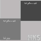
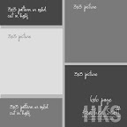

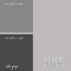
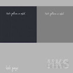
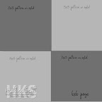
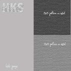
Remember you can twist and turn all the components - and sub pictures for papers etc.
Monday, May 5, 2008
Simply Savvy Schemes
6 x 6 Toodle Loo
I have started working on Rylea's baby book and I thought Toodle Loo was the BEST choice for this project!! In my layouts, I'm using Toodle Loo cardstock, ribbon, hardware and cardstock collection.
I AM So excited about this NEW concept, I have got several 6 x 6 layouts done, with the intentions of adding them to Rylea's 12 x 12 album!!
I used the scheme 2 - Quick Quads and Scheme 5 - Four Corners together several times in making these first pages!! I'm working on going forward with other layouts! So, here is my first layout!
As you can see the one on the left (with Rylea's first photos) I used the Four Corners scheme and on the right I used the Quick Quads! I think these 2 go together VERY well!!
OH, under the photo of Jackie and Rylea, I put a tag so Jackie could add her thoughts at that moment. This was something I didn't want everyone to see. It will JUST be meant for Rylea to read someday!!
I did the EXACT same thing here but made the photo on the bottom left a little longer than the 3 x 3.
I will be adding more later!!
Friday, May 2, 2008
8x8 page
I started with the Offset Opposites Scheme - a 6x6 Brown CS and 2 3x3 Rustic Chic papers.
I layered that 6x6 page to an 8x8 Kraft page. My photo is a 4x6 and I trimmed off about 1/2 inch from one side. On the 8x8 page I stamped Twists and Twirls with Versamark ink in 2 corners. I love the Office Notes stamp set for "little" journaling prompts. I punched out the File Tab punch from Ivory CS and folded it over the edge of the 6x6 page and stapled it on. Then I wrote my journaling with the American Crafts red journaling pen.
Tuesday, April 29, 2008
Side Splash take 2

Bringing out any size of page with an element like the 3x3 pieces is the perfect way to quickly get these pages done! For the remainder, I used the Miss Moxie papers again which I just LOVE and also black cardstock, the purple from Miss Moxie cardstock collection, black scrappers floss, coordinating hardware, and ribbon. I just love it!
My tip? Use the end of a paintbrush or another small tool and wrap your scrappers floss around it for a fun twirly effect.
Thursday, April 24, 2008
6 x 9 Savvy Side Splash
Wednesday, April 23, 2008
Mimi 8x8 page
I am having fun with the Quick Quads scheme - and adding it to an 8x8 size page - which is my FAV size to scrap. Not to big - not too small - and best yet I can use my 8 1/2 x 11 papers for the base of the page! I have used pieces from a Mimi Simply Savvy Schemes Page kit for this spread. I made 2 6x6 Quick Quad pages and then added them to the 8x8 pages butting them up to the inside edge of the spread. Under the 6x6 I layered some different sized pieces if Coordinating Mimi Cardstock. I also used the Office Notes Stamp Set from The Angel Company which makes journaling in a pinch a BREEZE!
Another TIP: When creating a Quick Quad that will be totally cover with pictures (Like the left side page) Don't use your good paper and cardstock. We ALL have TONS of papers that we don't like any more, right? Use it up! No one will be able to see it anyway! You can also use it for the right side page - because it is totally covers also with 3 3x3 pictures and one 3x3 pattern paper square. Genius!
Thursday, April 17, 2008
The Simplest Things

The Two Corners theme starts out this simple 12x12 LO. The bottom photos are left full size so you can see the sand and white cardstock is added for an accent. Coordinating squares of patterned paper are turned into photo corners and tabs, to carry the color throughout the page. The faux notebook detail on the left is made with the Bind it All machine.
Supplies:
Pop Rockz Soar With It Collection- The Angel Company
Alpha Grunge, Distressed Typewriter Bet, Mini Bet, My Sunshine, Floral Labels, This Girl (stamps from The Angel Company)
Palette Noir and Reflection Blue
Sky Blue Scrapper's Floss
Happiness (Four Corners)
 So sweet and simple. This four corners scheme is just right for keeping the smiles front and center and still leaves room for a title and a little journaling.
Supplies:(The Angel Company)
Pop Rocks Soar With It Collection
My Sunshine, Floral Labels
Palette Noir and Reflection Blue
Crystal Stickles
White Gel Extreme Pen

Wednesday, April 16, 2008
Scheme 9 - Two Corners
Scheme 9 is an alteration of Scheme 5 - Four corners. You just leave off 2 of the corner pieces.
Having the one side of your page empty allows you to use a larger picture there - or even just a longer picture!
The left page use the Two Corners Scheme - Allowing me to keep my photo 5 inches long. I did crop it to 2 3/4 wide though to fit in and allow for the border to continue around the picture.
Scheme 8 - Tucked Trio
Scheme 8 is an altered Two in a Row! By tucking a third 3x3 either behind or on top of the original 2 3x3's you end up with a whole new configuration. The first layout shows 2 tucked trios together flip flopped - for a 2 page spread using decorative paper as the tucked piece behind the photos in a row.
 The second layout shows on the first page a third photo is used as the third piece and on the second page a journaling tag as the third piece -on both pages it is layered on top of the two in a row. Also the page was turned on its side with the two in a row along the top on both pages.
Scheme 6 - Offset Opposites
Our 6th Scheme uses either a patern or solid 6x6 and 2 coordinating 3x3 squares. It will also allow you to use a larger picture as your focus on the center of the page. The right side pages uses this Scheme:
 See how I used a full size 3 1/2 x 5 picture as the focus? These pictures are from 15 years ago - and that was the size of the time - now you can't order prints that size!
Monday, April 14, 2008
Scheme 5 - Four Corners
This Scheme is very similar to Quick Quads -with a slight variation.
You will still crop and cut everything down to 3x3 size. When you adhere them to your page however, you will space them apart so that there is an equal border between all 4. Once you have them all stuck onto your page you will trim off the excess - bringing you back to the 6x6 page. It is so much easir that way than trying to cut them all to the perfect size. Here are some layouts with this skeme. The first one features the Four Corners Sheme with Scheme 7 - Color Blocked.
 The next two pair up Scheme 2 - Quick Quads and Scheme 5 - Four Corners

Scheme 4 - Tilted Two
This Scheme is a fun one - playful and fancy free!  You can use pattern or solid for your base page AND 3x3's to mix it up. You can also layer 1 larger photos on top of the whole page - or layer pics onto the 3x3's.
Scheme 3 - Over the Edge
This is another Simple Scheme - very similar to Scheme 1 Two in a Row. This time you will have your two pieces go "Over the Edge" of the page. You can turn this Scheme to have your pictures along the top or bottom too.
Here are some pages with this Scheme.
The left page in that layout is this scheme - and the right page is a Scheme 1 - Quick Quad.
adding to a bigger page
Not everyone scraps 6x6 - I know. The beauty of the Simply Savvy Page kits is that they can be converted to alternate sizes! They will fit onto 6x6, 6x9, 8x8, 9x9, 8 1/2 x 11, and 12x12!
Here you see a page I made with the Quick Quad Scheme 2. Just 2 pieces of pattern paper in the corners of a Kraft 6x6 page. Now you can take that page and add it to a 12x12 page.
 SO what I do is create the 6x6 pages - these i put into albums for grandmas and grandpas. Then I take the same page and add it to a 12x12 to put into Laney's Album. Brilliant right? Actually I make 4 of the 6x6 page and then 1 12x12 all at the same time - and the 4 pages go to all the grandparents albums that I compile each year and give to them for Christmas. I work on it all thru the year - and actually do a lot of it in November of course!
Here is another 12x12 page that has a Quick Quad 6x6 added to it. For this Quick Quad I wanted to keep one of the pictures 6 inches long - so i cut it to 3 inches wide and 6 inches long. Having it cut that way makes it take up 2 of the 3 inch squares on the page. Coolio!
Wednesday, April 9, 2008
Scheme 7 - Color Blocked
Our 7th Scheme is slightly more challenging - but not much! 
I started with a neutral 6x6 page. I place the right 2 3x3 squares (or pictures) "off the edge" to create the grid between them. After they are attached I then trim off the excess from the back. Then I placed the middle left block. Once that is in place you can trim off any excess again. For the top and bottom left pieces I just did the same thing! Attach them so that you have equal grid in between all your pieces, and then trim off the extra from the back side. Easy Peasy!
The left page of the following layout uses the Color Blocked Scheme. The right page is an Over the Edge scheme.
Scheme 2 - Quick Quad

For our second Scheme - we are going to get to the nitty gritty of this system! We want to be able to get a lot of photos in to our spreads right? Even though I am only using a 6x6 page - I can still get 6 or 7 pictures on a 2 page spread! That ROCKS!
What I have done is started with 3x3 blocks again - this is the foundation of this system. I also cut my pictures down to 3x3 squares. If you are using digital pics you would just edit them to be that size and print from there. The pictures I have used for this page were actually printed 14 years ago! SO they are 3 1/2x5's. And since zoom technology was not anywhere near where it is today - I am able to crop them easily to 3x3! Yeah!
Here are a few of the spreads that I completed using 2 Quick Quad Schemes side by side. You can click on the images to view them larger.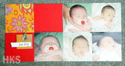


That last spread - the page on the right is a slight alteration on the Scheme - which is Scheme 5 -Four Corners.
Tuesday, April 8, 2008
6x6 Flap Book
 Make a great gift in no time by transforming your page kit into a mini flap album. Score a 12x12 piece of cardstock at 6" both ways and cut away one of the four squares. Now fold on the score lines and use your favorite 6x6 schemes for the pages.
When opened, the two-page layout below is displayed. When the flap on the right is flipped up, two more pages are revealed.
The borders are made by cutting the 6x6 pieces in the page kit into 2"x6", 1.5"x6" or .5"x6" strips. Journaling blocks, tags and tabs are made from the 3x3 blocks that are included in the kit.
(Click the photos for a larger view.)
Cut Components 12 x 12 Scheme

Mix it up a little by adding a 12x12 coordinating cardstock and cutting up the components to your page kit. The golden border and title block is made up of a 6x6 cut into three 2x6 pieces. The green journal block, as well as the blue circles and "together" tag were cut from a couple of the 3x3 blocks in the kit. I made the photo corners and the "S" from a 3x3 block as well. See Heather Scott's instructions on making this little accent that has big impact on tying your page together.
Friday, April 4, 2008
Scheme 1 - Two in a Row

This Simply Savvy Scheme is the most basic of the batch. It is always good to start simple, right? We are starting with a 6x6 layout. I doubled it up to make a 2 page spread.
If you use a neutral for you base page and then save your pattern and cardstock pieces for the accent pieces your kit will go a long long way!
Always remember you can embellish and add layers as you wish. I kept this one simple - just adding a few tags and some ribbon.
Depending on how you crop your photos - it can handle as many as 4 pictures!
Here are a few spreads I created from this sketch:


Another thing to remember is that you can TURN all the schemes too! How your two in a row along the side, across the bottom. LOTS of options!


